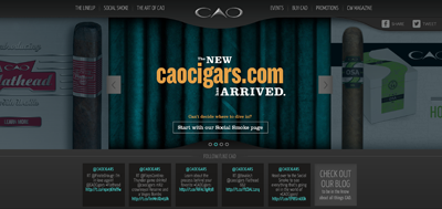
Now I’m not one for delivering news or press releases or anything like that. I did however see the update from the CAO cigars Facebook page the other day announcing their new site. So I was naturally intrigued to go check it out. I’m a huge fan of web technologies and I always like to go and see what other people are doing with their sites. So I went and kicked around on the site for a bit. I’m not trying to ‘review’ their site per se I’m just taking note on some of the new cool things they’ve done. I honestly should have done this when Drew Estate launched their new site because it was a vast improvement on what they had previously and it is now packed full of great information. Hopefully CAO can do the same thing. So here we go, my first ever cigar website “review”.
Layout
Overall the page has a very dark feel to it. The color palette is black and silver which are classic colors that CAO has used in a lot of their marketing materials over the years so it wasn’t a surprise to see this. The first thing I notice on the home page is the slider rolling through that is meant to give you the latest news and going on’s at the company. My favorite slide is the one actually announcing the new site. I really love the font that they used for that slide. Something just makes it stand out and it’s easy on the eyes.
One thing that I’m not a big fan of is the scrolling tweets towards the bottom of the homepage. I don’t like the electric blue color that they used. Just a personal preference, maybe it’s indicative of their next product launch? Because it seems to be used pretty heavily across the site? Who knows, but when their next release comes out we’ll know for sure, and I can say “told you so”!
The Lineup
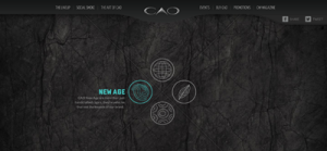
The rest of layout is pretty typical for the current web design trends going on. I like the navigation across the top. I start at the top left and clicked on “The Lineup” to see what it’s all about. This page is actually pretty cool it’s split up into four sections that look like those origami paper decision maker things that we used in middle school. So I clicked on the icon for “new age” because it has a similar logo used on the Hurricane release that we reviewed previously. This includes most of the line up of sticks that I have personally smoked. Things such as the Flathead and the Concert and the ‘newer’ age sticks. There is a lot more in this section of the site, where it talks about their entire line up of cigars. So a lot of the time was spent on this section learning about the different sticks and blends.
Social Smoke
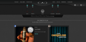
Now this is a really cool section of the site! This contains all their social media feeds pulled into one page. What I didn’t notice the first time around are these ‘switches’ at the top of the page and you control which social media feeds you see on the page. Now, being a web developer as my day job this is pretty cool to me and I haven’t seen something like this done before. So I may have to use it for ‘inspiration’ on a future project. This page will load more content if you scroll to the end and want to see more. It’s a good layout and clean which I like. Not a ton of new information on here though, a lot of tweets and things like that. I think once some new pictures are incorporated with their social stream this could be a very cool place to just sit and watch the feed roll in.
The Art of CAO
This is what I love seeing on company websites. The heart and soul of the company. This is what separates a good company site from a great one. How can I relate to these people behind this brand? This section of the site is full of videos and great imagery. It talks about the ideas behind some of their latest launches and how they came up with them. It has a few pieces on the people behind the brand as well which is always exciting to see. So to me this is an excellent section to have. Because nowadays to keep building a brand you have to be able to connect with people

The Events
Ehh, it’s a little lacking at this point. So I’m going to skip over that. Hopefully with time they’ll get it populated with events soon.
Where to Buy
This is actually a pretty cool section. I’m not exactly sure what technology they are using to generate this but I love it. I’ve seen some store locator maps that are absolutely atrocious, this one is not. It’s a fantastic layout and great functionality. So Kudos, everyone for a job well done on this section! If you’re ever looking to find some CAO cigars around your area this is very easy to use tool and you can get your fix asap!

Promotions
This section is basically just trying to boost the fan base of CAO. It’s nice place to put it, but it could use some work as well. I’m not sure if they need a dedicate page for it, but it’s there and hopefully it’s working for them. I always think that the social media stuff should be at the header and footer and people will find them. The email opt-in is always a tricky subject so this is a decent place for it. I would like to see a little stronger caller to action with it though. Just my personal pet peeves and they may or may not hold any merit.
CW World
This section takes you offsite to the big all encompassing General Cigar website. Which is a great site all on it’s own as well, but I’m not really going to go in-depth on it here.
Conclusion
Overall, it’s a huge improvement over CAO’s last site. That site was very difficult to get information about the cigars or about anything that was going on. It appears that they’ve decided to be a little more open about their process and what’s going on. More importantly they’re giving the consumer more information about their cigars. All the sizes available, what the components are and everything like that. I would like to see more information on how all the blends were thought of and how they came into fruition. They do that with a few of the newer sticks, but there are some of the older sticks like the La Traviata that I would like to know about. So there is always room to scale and add that information in later, but right now I’m a big fan of this new site! So good work everyone at CAO.
